CASE STUDY

CASE STUDY

Giving HR the visibility they were always owed.

A B2B command center that transforms medical credit from a black box into a transparent, self-serve program HR can actually run.

Client

QubeHealth

Duration

4 Months · 2023

My Role

Lead UX Designer

Team

Team

Sai Trinath Naidu

Sai Trinath Naidu

Lead UX Designer

Lead UX Designer

Visnu Manekar

Visnu Manekar

UI Designer

UI Designer

Afnita Jalal

Afnita Jalal

Graphic Designer

Graphic Designer

Duration

Duration

4

4

Months

Months

Feb 2023 — Jun 2023

Feb 2023 — Jun 2023

Tools

Tools

Figma

Figma

Figjam

Figjam

Notion

Notion

Monday.com

Monday.com

Challenges

Challenges

The program was live. The employer was blind.

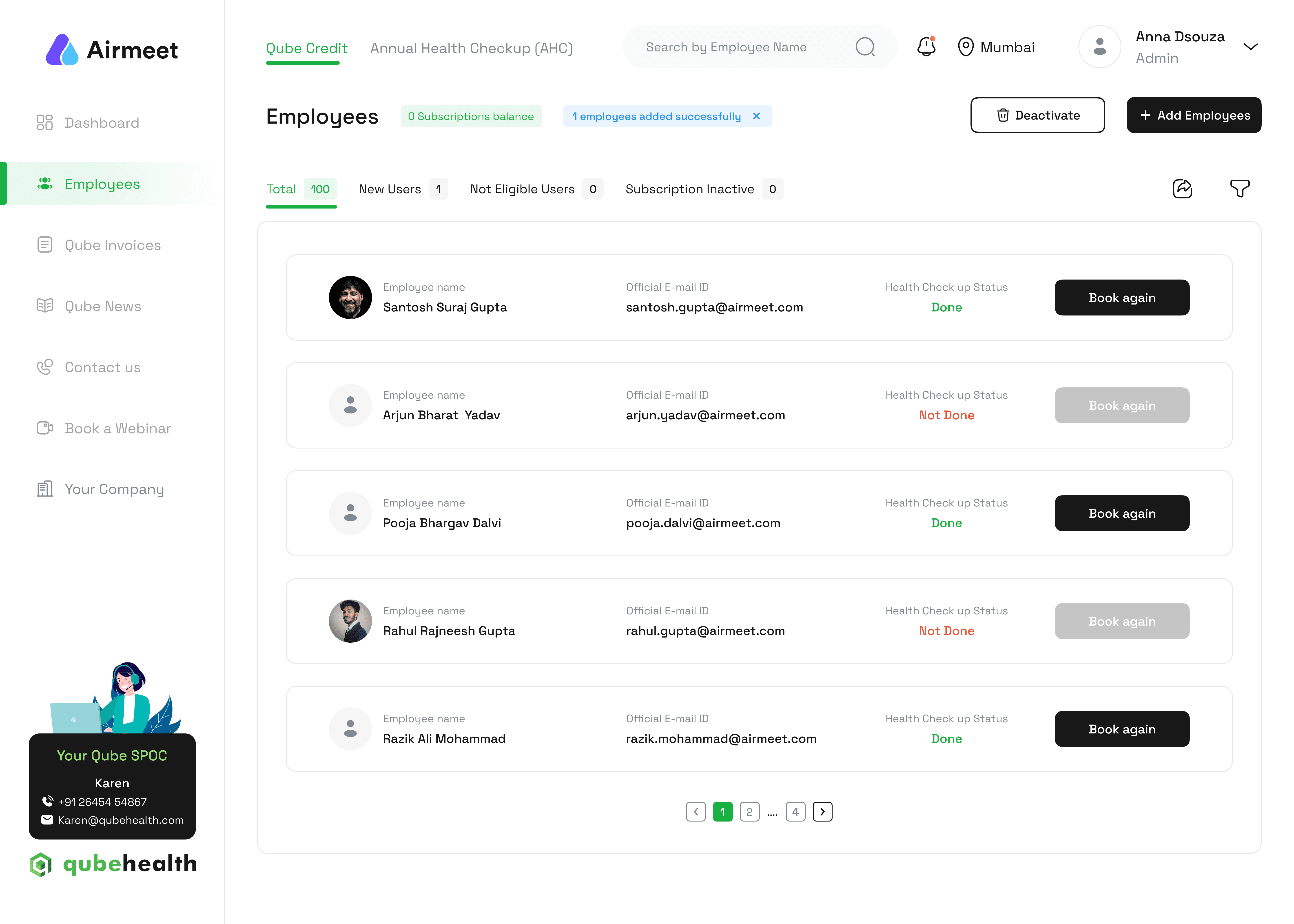
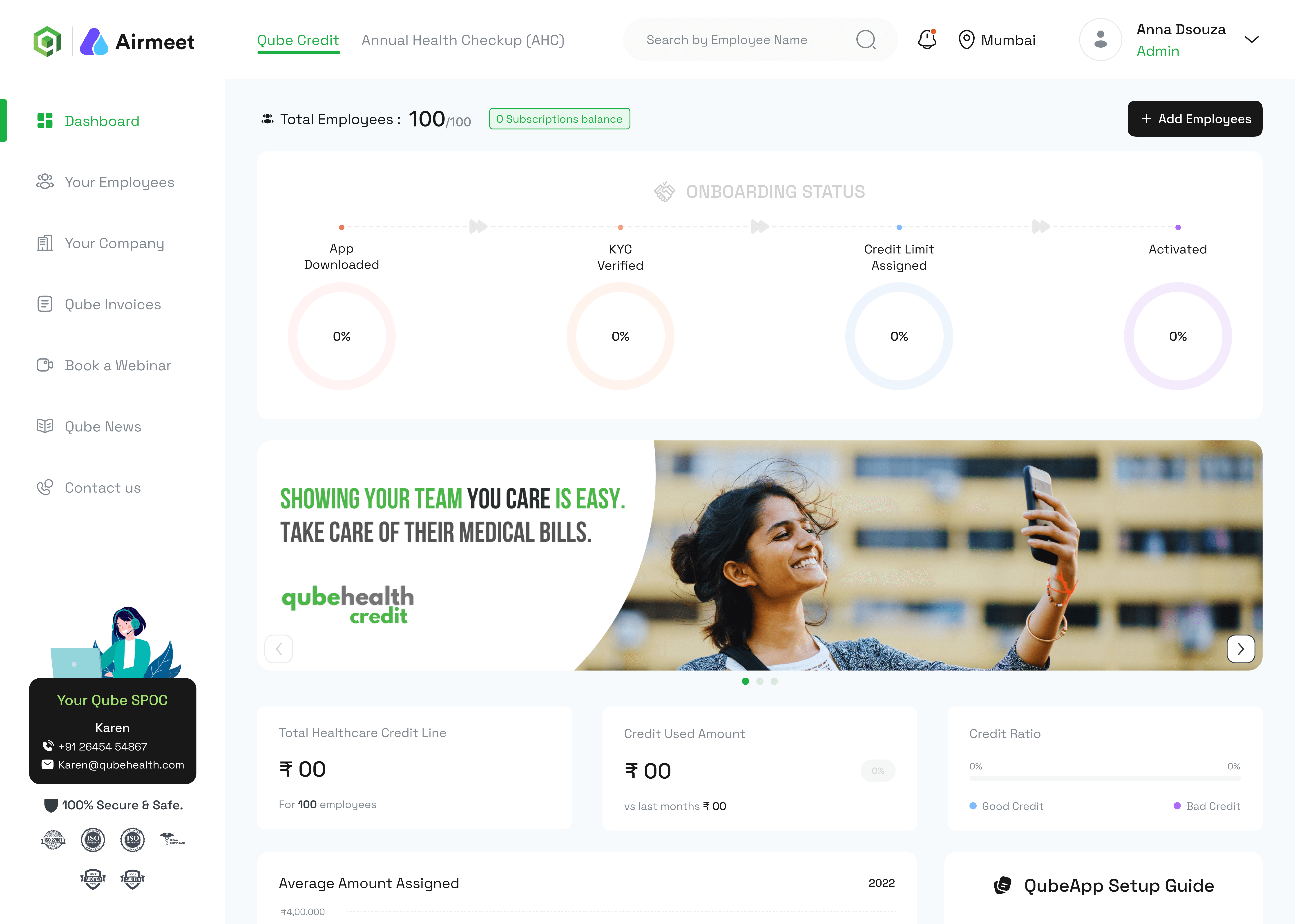
QubeHealth had already solved the employee side. The credit line worked. The app was shipped. But the companies paying for it had no idea if it was actually working.

HR managers were subscribing to a benefit they couldn't see, couldn't measure, and couldn't manage. Who enrolled? Who used their credit? How much was spent? When does the subscription lapse? Every answer required a support ticket. Every support ticket eroded trust.

The dashboard wasn't a "nice to have." It was the operational backbone the program needed to survive at scale.

The Buyer

The HR Manager

Responsible for hundreds of employees. Needs to enroll staff, track credit usage, schedule health checkups, handle invoices, and renew subscriptions — without a dedicated ops team or technical support.

The Buyer

The HR Manager

Responsible for hundreds of employees. Needs to enroll staff, track credit usage, schedule health checkups, handle invoices, and renew subscriptions — without a dedicated ops team or technical support.

The Program

The Subscription Model

B2B revenue only holds if employers renew. Employers only renew if they see adoption. Adoption is only visible if the dashboard makes it obvious. The entire business model rested on this interface working perfectly.

The Program

The Subscription Model

B2B revenue only holds if employers renew. Employers only renew if they see adoption. Adoption is only visible if the dashboard makes it obvious. The entire business model rested on this interface working perfectly.

The Risk

The Data Layer

Employee PAN data, activation status, credit limits, invoicing history — all sensitive, all interconnected. One wrong deactivation or a missed invoice creates downstream financial and legal exposure.

The Risk

The Data Layer

Employee PAN data, activation status, credit limits, invoicing history — all sensitive, all interconnected. One wrong deactivation or a missed invoice creates downstream financial and legal exposure.

The real design challenge wasn't building a dashboard. It was making complexity feel manageable — so an HR manager with 300 employees and 20 minutes could run the entire program without opening a single support ticket.

The real design challenge wasn't building a dashboard. It was making complexity feel manageable — so an HR manager with 300 employees and 20 minutes could run the entire program without opening a single support ticket.

Process

Process

From feature list to decision-making machine.

Three modules. Two user speeds. One principle: every answer should take under three clicks.

01

01

Mapping two distinct user modes

Mapping two distinct user modes

HR managers don't use dashboards the same way every day. Some days it's a quick check — "did that new hire get activated?" Other days it's strategic — "is our renewal worth it this quarter?" I mapped tasks into two speeds: routine operations (add/remove employees, download invoices) and strategic oversight (usage statistics, onboarding rates, health checkup reports). The architecture had to serve both without making either feel buried.

HR managers don't use dashboards the same way every day. Some days it's a quick check — "did that new hire get activated?" Other days it's strategic — "is our renewal worth it this quarter?" I mapped tasks into two speeds: routine operations (add/remove employees, download invoices) and strategic oversight (usage statistics, onboarding rates, health checkup reports). The architecture had to serve both without making either feel buried.

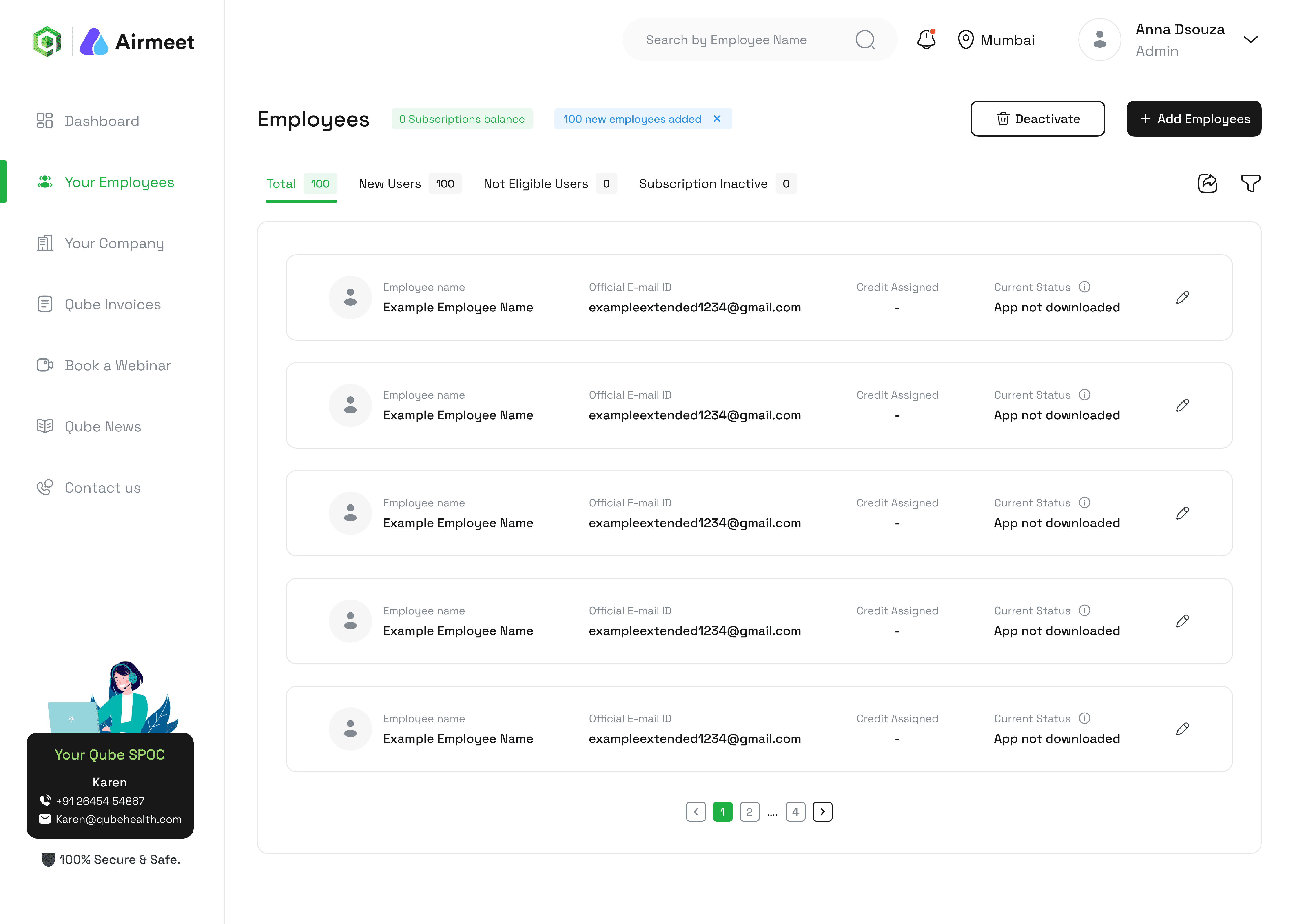
The sitemap resolved into three primary modules: Employees, Qube Credit, and Payments. Everything else was a depth level underneath.

02

Employee management without catastrophic errors

Employee management without catastrophic errors

Adding and removing employees sounds simple. It isn't. Bulk uploads via Excel are notoriously error-prone. Individual form entry is slow and inconsistent. I designed a two-path upload system — bulk via a downloadable template that enforces structure before it's ever uploaded, and individual via a guided form — with an editable review state before any record is committed. Deactivation required explicit confirmation. Not a toggle. A deliberate action.

Adding and removing employees sounds simple. It isn't. Bulk uploads via Excel are notoriously error-prone. Individual form entry is slow and inconsistent. I designed a two-path upload system — bulk via a downloadable template that enforces structure before it's ever uploaded, and individual via a guided form — with an editable review state before any record is committed. Deactivation required explicit confirmation. Not a toggle. A deliberate action.

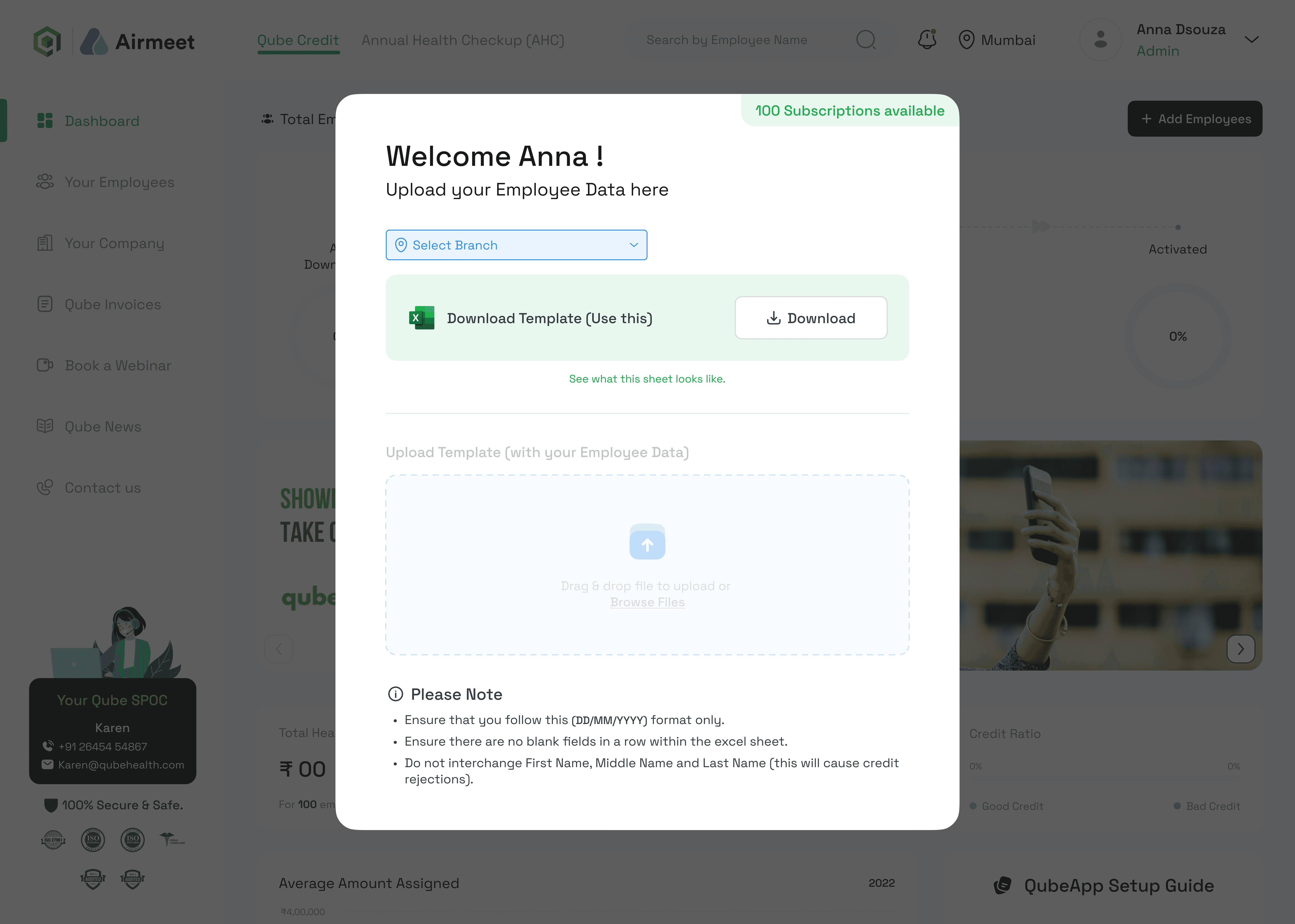
The Edit state before every bulk commit eliminated the most common HR data error: uploading the wrong version of the file.

03

Health checkup management as a scheduled workflow

Health checkup management as a scheduled workflow

Annual health checkups aren't one-time events — they're a recurring coordination problem. HR needs to view statistics, read reports, schedule new camp visits, select packages, and cancel if plans change. I designed this as a calendar-native workflow rather than a static list, so upcoming checkups felt like events to manage, not data to read.

Annual health checkups aren't one-time events — they're a recurring coordination problem. HR needs to view statistics, read reports, schedule new camp visits, select packages, and cancel if plans change. I designed this as a calendar-native workflow rather than a static list, so upcoming checkups felt like events to manage, not data to read.

Scheduling a new checkup collapsed into three steps: pick a date, select a package, request a callback. No ambiguity about what happens next.

04

Payments that don't require a finance degree

Payments that don't require a finance degree

Invoices and renewals live in separate mental contexts — one is accounting, the other is a business decision. I kept them structurally separate in the Payments module. Invoice history and unpaid invoices under one branch. Renewals — including the edge case of adding a new employee who wasn't paid for in the previous cycle — under another, with a dedicated payment screen that clearly states what's owed and why.

Invoices and renewals live in separate mental contexts — one is accounting, the other is a business decision. I kept them structurally separate in the Payments module. Invoice history and unpaid invoices under one branch. Renewals — including the edge case of adding a new employee who wasn't paid for in the previous cycle — under another, with a dedicated payment screen that clearly states what's owed and why.

The unpaid invoices view was the single most requested feature in discovery. It existed nowhere before this dashboard.

Two Upload Paths, Zero Confusion

Bulk upload follows a download → fill → re-upload → edit loop. The template enforces the correct format before HR ever touches the upload button. Wrong column? It won't accept it.

Two Upload Paths, Zero Confusion

Bulk upload follows a download → fill → re-upload → edit loop. The template enforces the correct format before HR ever touches the upload button. Wrong column? It won't accept it.

Employee Profiles as Source of Truth

Each employee has a searchable profile with an edit state and a deliberate deactivate action. HR can drill from the full list to an individual record in two taps — and only change what they need to.

Employee Profiles as Source of Truth

Each employee has a searchable profile with an edit state and a deliberate deactivate action. HR can drill from the full list to an individual record in two taps — and only change what they need to.

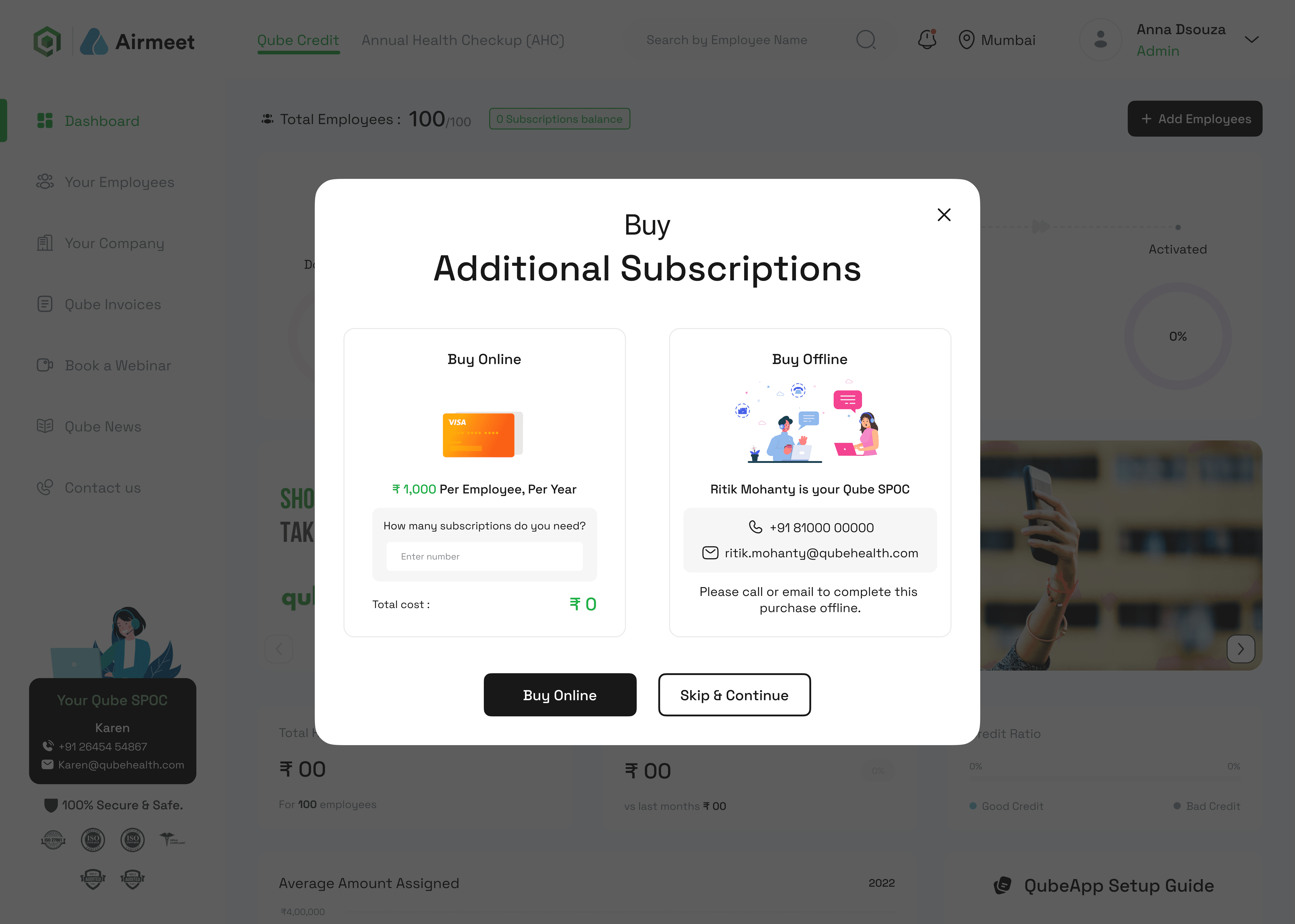
Subscription Renewal with Context

Renewals surface alongside previous invoicing history. HR isn't making a blind decision — they're renewing with full visibility into what was charged, when, and for whom.

Visual Decision

Visual Decision

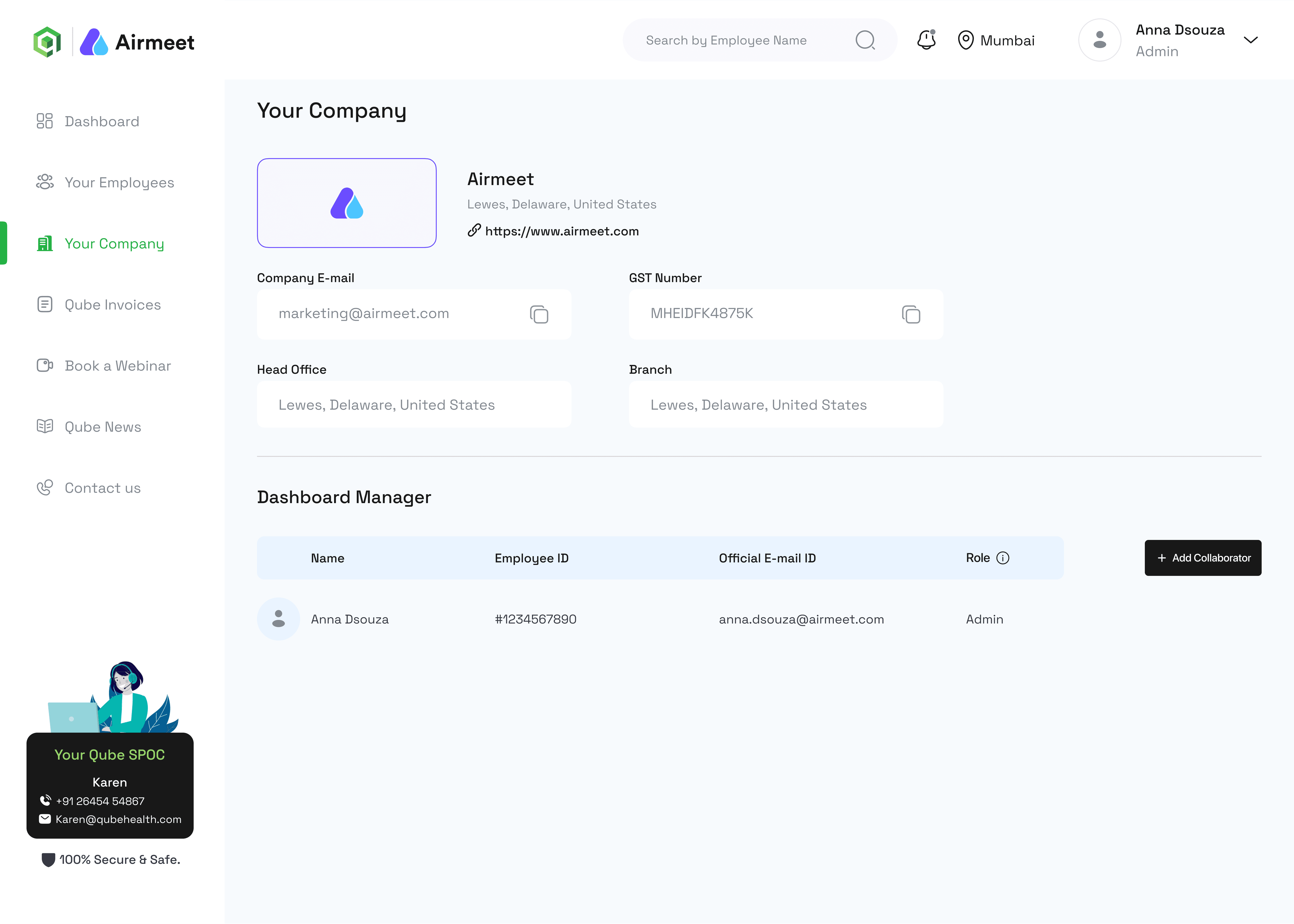
One design system. Two products. One language of trust.

The employee app and the HR dashboard share a design system — but they have completely different psychological contracts. The app speaks to a stressed individual. The dashboard speaks to an accountable professional. Same tokens, different emotional register.

Canvas

White canvas, grey structure.

The dashboard operates on a white base with a grey background layer separating the sidebar, header, and content panels. No decorative elements. No illustration. The UI gets out of the way and lets the data be the content — because for HR, the data is the product

The dashboard operates on a white base with a grey background layer separating the sidebar, header, and content panels. No decorative elements. No illustration. The UI gets out of the way and lets the data be the content — because for HR, the data is the product

#FFFFFF

#F6F6F6

#F6F6F6

Action Color

the brand thread.

The same vibrant green from the employee app appears here as the brand anchor. But its role shifts. On the employee side, green drives action — it's the "approve," the "confirm," the psychological forward signal. On the dashboard, green recedes into structural identity. It marks the platform, not the next step.

The same vibrant green from the employee app appears here as the brand anchor. But its role shifts. On the employee side, green drives action — it's the "approve," the "confirm," the psychological forward signal. On the dashboard, green recedes into structural identity. It marks the platform, not the next step.

#A1E06D

#181818

Typography

Space Grotesk — inherited, intentional.

Space Grotesk — inherited, intentional.

The dashboard carries over Space Grotesk from the employee app. Not by default — by design. The same typeface spanning both surfaces signals to HR managers that they're operating inside the same product ecosystem their employees use. A single type family across the B2B and B2C layers creates coherence without sameness. Headers H1 and H2 anchor section titles. Sub-Headers Sh1 through Sh3 organise dense tabular data. Body B1/B2/B3 handles the operational fine print that HR actually reads.

The dashboard carries over Space Grotesk from the employee app. Not by default — by design. The same typeface spanning both surfaces signals to HR managers that they're operating inside the same product ecosystem their employees use. A single type family across the B2B and B2C layers creates coherence without sameness. Headers H1 and H2 anchor section titles. Sub-Headers Sh1 through Sh3 organise dense tabular data. Body B1/B2/B3 handles the operational fine print that HR actually reads.

Outcome

Outcome

Shipped. Transparent. Renewed.

The dashboard gave QubeHealth's B2B clients something they never had: operational ownership of the program they were paying for.

<3 clicks

Average depth to complete any primary HR task — enroll an employee, view an invoice, schedule a checkup.

100%

Reduction in support tickets for employee status queries after dashboard launch.


From "email us to check" to self-serve in one release.

40%

Faster subscription renewal decisions by HR managers.


With invoice history and usage stats visible in the same session, the renewal was no longer a leap of faith.

01

Operational tools need operational empathy.

The HR manager using this dashboard has 15 other things open. They're not exploring — they're executing. Every screen had to answer one question: "what do I need to do right now, and where is it?"

02

Edge cases aren't edge cases in B2B.

The "add an employee who wasn't included in the last payment cycle" scenario sounds niche. It came up in nearly every client conversation. Designing for the exception is what makes an enterprise tool trustworthy.

03

Transparency is a retention strategy.

Employers renew when they can see the program is working. The dashboard isn't just a management tool — it's a proof-of-value surface. Every usage statistic shown is an argument for renewal made automatically.

04

The sitemap is the design.

Information architecture on a dashboard this complex isn't a pre-design step. It is the design. Three weeks of IA work saved months of redesign. Modules that make sense structurally feel intuitive in use.

01

Emotion is the real brief.

The functional requirement was "KYC flow." The real brief was "make a panicking person feel in control." Those aren't the same problem, and only one of them produces a 92% completion rate.

02

Emotion is the real brief.

The functional requirement was "KYC flow." The real brief was "make a panicking person feel in control." Those aren't the same problem, and only one of them produces a 92% completion rate.

03

B2B products live and die on adoption.

The employer is the buyer, but the employee is the user. Design for the wrong person and no one renews. Employee adoption above projections was the only number the client actually cared about.

04

Research before Figma, always.

Mapping data constraints against API capabilities eliminated entire feature categories before a pixel was placed. The most valuable design work I did on this project was in a spreadsheet, not a canvas.

2026 © Trinath Naidu

2026 © Trinath Naidu

2026 © Trinath Naidu